This week we had a guest speaker, Chris Clarke, UX architect at the Guardian. He gave us a really interesting overview of how the Guardian runs some of their usability testing, creates simple prototypes and gets things out the door for people to give feedback on.
They have pulled together a panel of international enthusiasts, who give their time voluntarily to give feedback on various designs and prototypes. The Guardian made a choice not to be precious about what they let people see. Some stakeholders might worry that, since things have the Guardian logo on them, they should be careful about what they let out. But, craving the feedback, they’ve made the smart choice to put those worries aside. The benefit of getting comments and opinions at the early stage, outweighs the risks.
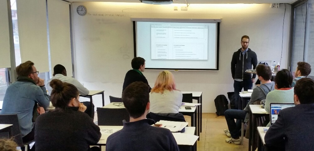
Chris Clarke Talk
With any idea they come up with, they develop a little blurb:
We believe that [doing this] for [these people] will achieve [this outcome]. We’ll know this is true when we see [this outcome].
They then set about developing that idea and testing those outcomes.
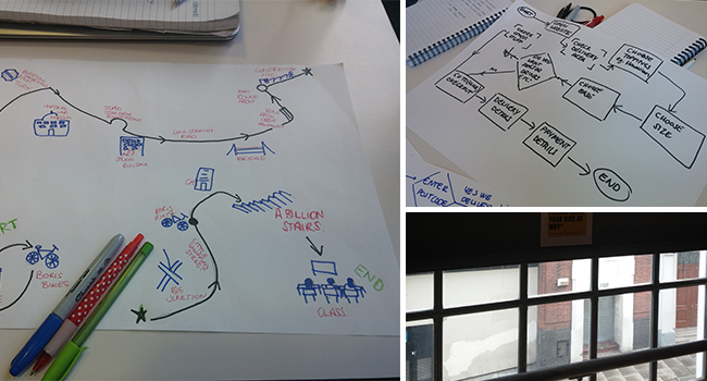
We started a little workshop of prototyping for our projects, based off the wireframes we already created. I started out linking my Balsamiq prototypes together and this does work well. Here’s a little view of what I’ve got set up in Balsamiq for my home page:
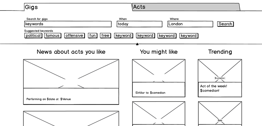
Home Page Wireframe
However, I found myself getting a bit frustrated with the process, and wanting the option to add interactions. So after talking it over with Joe (the teacher) and the TA’s, I decided to go ahead and start coding up a prototype in HTML/CSS/jQuery.
There are advantages and disadvantages to this. It gives me more flexibility and functionality in my prototype. It will take a little longer than linking together flat Balsamiq prototypes… but, for me (for this project), it seems neater and more productive to do this. It also means I got started on putting in some fluid responsiveness!
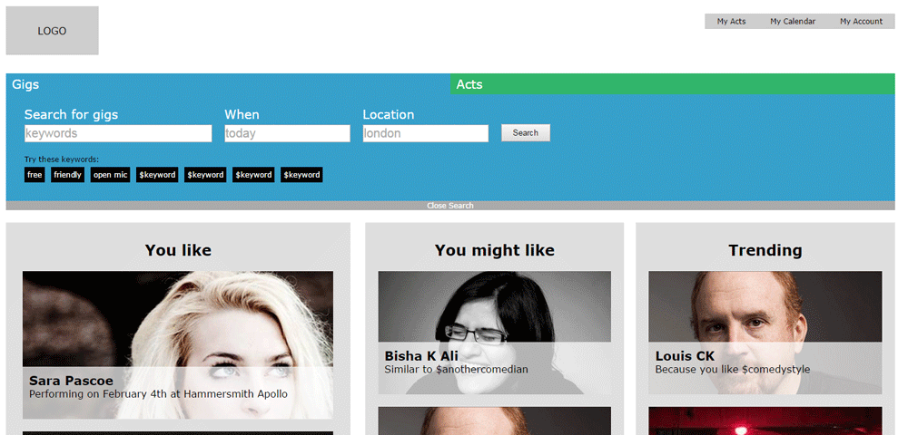
Prototype
We also watched this video where rapid product design meets flashmobbing. A team sets up a workstation right inside a shop, creating an app that will be used in that shop once they leave. While they’re there, they interview customers, show them wireframes and prototypes, and actually develop the app.
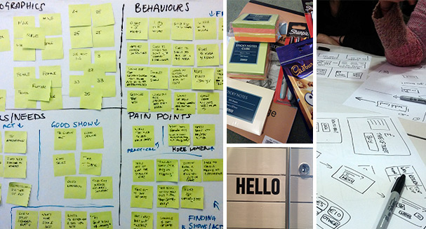
In the second half of class we looked at Form Design, starting with a brain storm of all the form elements we could think of

Form Elements Brainstorm
Then we went through some guidelines for user friendly form design, thinking about validation, layout, using different elements appropriately etc.
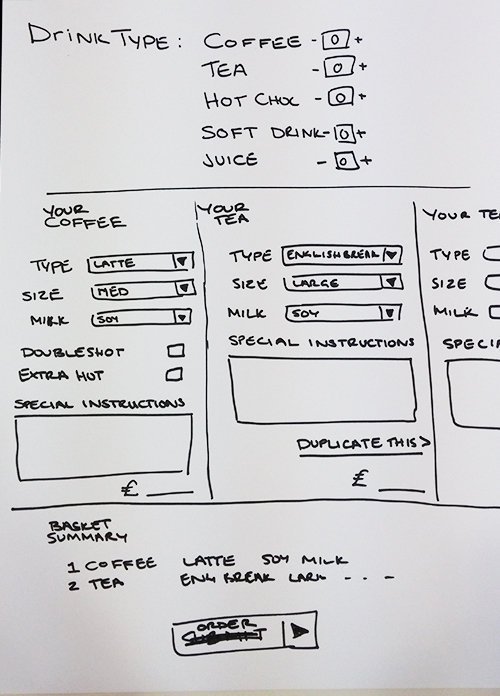
Drinks Order
As an exercise, in groups, we designed a form to order coffee in Starbucks.
Imagining this as an in store kiosk, we wanted to make it easy for people to order more than one drink. The customer would first see the section at the top, and select the number of each type of drink they want. Then, the panel below would fill out with a section for each one of those drinks. They can fill out the options for each drink or “duplicate” it, if similar or identical drinks are required.
This week we have no official homework, so I’ll just be carrying on with my prototyping!