
Usability is…
“The extent to which a product can be used by specified users to achieve specified goals with effectiveness, efficiency, and satisfaction in a specified context of use.”
Okay…. there are three important words there:
- Effectiveness
- Efficiency
- Satisfaction
So, Usability is about how well, and easily a user can complete a task and how happy they are about it. That seems pretty simple, but it’s also kind of abstract.
Luckily, there are some more specific heuristics which break down what we should be thinking about. These 10 principles were developed by Jakob Nielsen and are a great place to start evaluating usability. Let’s look at each one, along with some examples where they are implemented well.
The 10 heuristics for user interface design
1. Visibility of system status
Translation: Let the user know what is going on.
The user cannot always see directly inside the system, so it is important to give feedback letting them know answers to questions like, “how far through the sign up process am I?”, “How much of this file is loaded?” and “How long will I have to wait for the next stage?”
Good Example: Kickstarter’s Project Creation Process
Starting a project on Kickstarter is a complicated process so it’s important that they’ve made it as easy as possible. I can clearly see which sections of the form I have completed and which are still to be done.
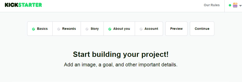
Creating a Project on Kickstarter
Good Example: Facebook’s Photo Upload Process
Uploading a single photo usually only takes a couple of seconds but, even so, Facebook shows me a progress bar so I know it’s working and I can see when it will be complete.
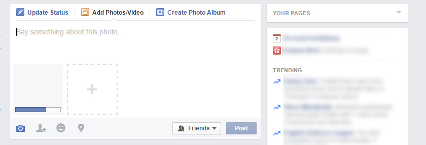
Uploading a photo on Facebook
2. Match between system and the real world
Translation: Design systems based on familiar ideas and concepts
This is about creating similarity between a virtual system (such as a website) and a real world system that humans are more familiar with. We do this a lot – we talk about folders, pages, files, windows and buttons. All of these are real world concepts translated into a digital system.
It’s also important to use appropriate language for the sort of system you’re designing. For example, a website aimed at teenagers would use different language to one aimed at the elderly. Furthermore, a device for some specific group of people, such as an app for photographers, should use relevant jargon.
Good Example: Spotify’s Language
Spotify uses words and concepts like “Queue”, “Playlist”, “History”, “Lists” etc. All of these are things we’re familiar with from the real word, and they are words used in music listening offline too.
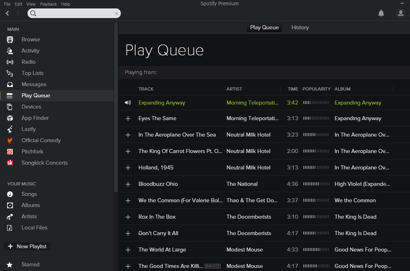
Spotify
3. User Control and Freedom
Put the user in charge and give them the ability to do things freely. This especially relates to undo and redo. Users should have the ability to “go back” and fix mistakes without hassle.
Good Example: Gmail’s Undo
Gmail lets me undo sending an email – even after I’ve sent it!
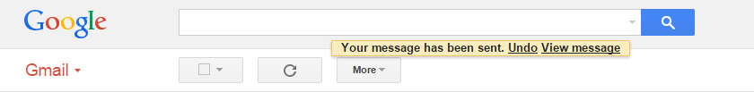
Gmail Undo Send
4. Consistency and standards
There are certain things that have become convention, it is rarely a good idea to break these conventions in your designs. For example, users are used to links being highlighted with a different colour or an underline (or both). Some language has also become standard – users are more likely to be scanning around the page for the phrase “About Us” than “Get to know the team”.
It’s also important to keep consistency within your own system. If the menu is in the top left on one page, it should be there on every page!
Good Example: BBC iPlayer
The BBC sticks to a number of basic conventions here. The menus and logos sit exactly where I’d expect. They use a magnifier icon to signify search (twice). Interestingly… one way they break the mould is to use some sideways scrolling. However, it is easy to use because they’ve included huge buttons directing me to what’s going on, and it is consistent across every page of iPlayer.
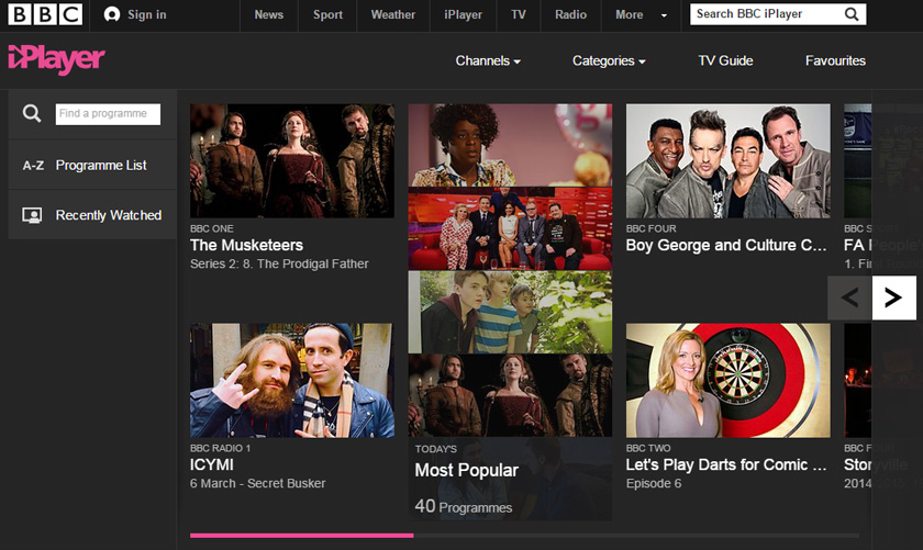
Conventions on BBC iPlayer
5. Error prevention
It’s often possible to stop an error from even occurring. There are a couple of main ways to do this. One is to design things clearly so, for example, the “delete” button is clearly distinct from the “save” button. Another is to detect if the user may have committed an error and ask them to confirm their action.
The second should be used with careful consideration. Sometimes it is annoying to be asked to repeat an instruction, you don’t want to leave the user feeling like you think them incompetent. If there are no important consequences of an action, or it is easy to undo it, then perhaps its not necessary to ask the user to confirm. However if you’re confident you’ve detected an error, then the user will thank you for pointing it out.
Good Example: Gmail’s attachment reminder
This has saved my bacon a number of times! When writing an email and talking about an attachment, Gmail lets me know if I’ve forgotten to actually attach anything. Brilliant.
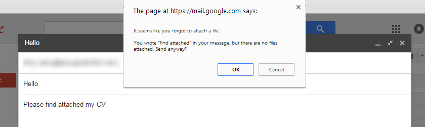
Gmail attachment reminder
6. Recognition rather than recall
It’s a lot easier to recognise something when you see it, than it is to remember it cold. Users should be given options to choose from, instead of having to think up possible options themselves.
Good Example: Foursquare’s suggestions
Foursquare, needs to know what I’m into so they can give me good recommendations – but they don’t just ask me to come up with ideas. They suggest a bunch of popular things, so I simply have to click on them.
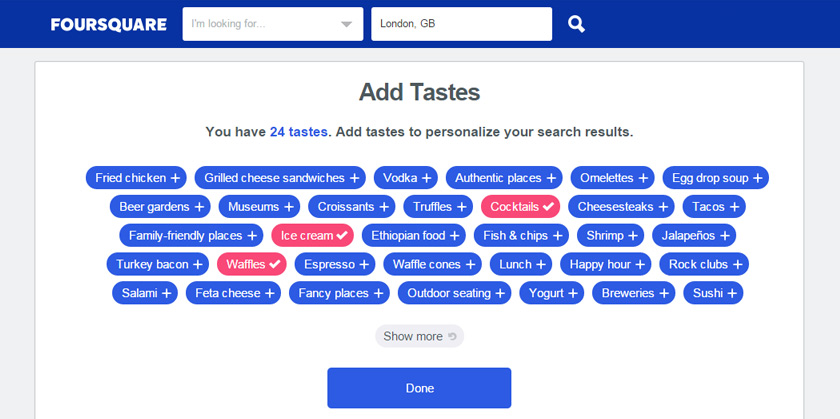
Foursquare’s suggestions
7. Flexibility and efficiency of use
Make your design flexible, to deal with a variety of situations. Some users are experts, some are novices, so they won’t all have the same abilities or needs. Do all your users need to see all the possible options, or can you hide some away in most cases? If you know that certain users perform one task often, while different users usually do another task, perhaps you can tailor your system for each group.
Good Example: Windows’ advanced settings
The use of an “advanced settings” link is common. Here’s windows shows me the simpler display settings and hides the more complicated options behind a quick link. They’re still accessible in a separate window to users that need them, but they won’t confuse or scare off the beginners.
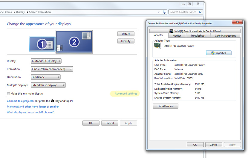
Windows advanced settings
8. Aesthetic and minimalist design
Minimalist design is about making sure that everything presented to the user is necessary and useful. Important things can easily get lost if they are surrounded by clutter so it’s important to keep things simple. Aesthetic considerations are where visual design comes into play but function should always come ahead of form, don’t design pretty sites that are difficult to use.
Good Example: Google’s search page
There’s a beautiful simplicity to Google’s search page. It provides everything the user needs (and only a little more). They show personality by changing the logo to celebrate various special days. This one is for International Women’s Day 2015.
On this screen also we see them promoting a campaign, #DearMe. Google does this extremely sparingly which means we’re not bombarded by stuff all the time and lends weight to things they do decide to promote – it implies it’s really important if Google let it take up some of their hallowed white space.
They’re adding aesthetic and experience flourishes that don’t detract from the user experience one bit, the search box is still right there, easy to find and use if I’m in a hurry. But, if I have a little more free time, Google guides me towards something worthy of my attention.
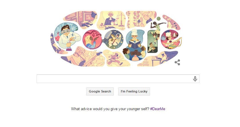
Google Search
9. Help users recognize, diagnose, and recover from errors
Sometimes errors are unavoidable. In those situations, you should design your system so that users can easily see what has happened, and find a solution. Language is one key thing here – an error message can be a jarring experience, but it’s also an opportunity to communicate with your user, so make sure you do it well. It’s also an opportunity to guide the user towards a solution, give them tips for solving the error, and send them on their way.
Good Example: iStockphoto’s 404
Cute 404 pages are kind of a “thing” now, here’s one from iStockphoto. They show me a nice image (from one of their own artists, of course) and speak in language that humanises the site and doesn’t imply the problem was my fault. Then they also suggest some links that might help me out.
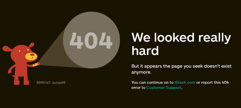
iStockphoto’s 404 page
Good Example: MailChimp’s log in errors
It’s amazingly rare to see a site do this – but here is Mailchimp flying the flag for helpful log in error messages. If I attempt to log in with incorrect details, they give me different error messages depending on whether I’ve given the wrong password for an existing user, or if I’ve completely messed up and got the username wrong too. This means I don’t have to wonder about which bit of info is wrong, and I can reach a solution (which they give me direct links for) sooner.
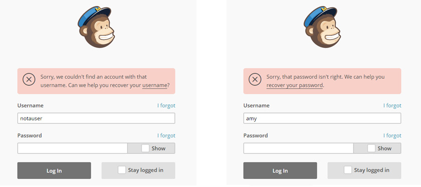
Mailchimp log in errors
10. Help and documentation
Ideally, all systems would run without the need for help but that’s not realistic. When help and instructions are needed, they should be accessible, understandable and accurate.
Good Example: Etsy’s help pages
This page is beautifully designed, with a large search box at the top (with a tip inside to help me out), then they provide links to some of the most commonly needed resources, in a few different ways. Firstly organised into categories, then with large icons. Then for more detailed help, they direct me towards the FAQ, the forums and the site policies. Lastly the contact link is there if I haven’t found my answer.
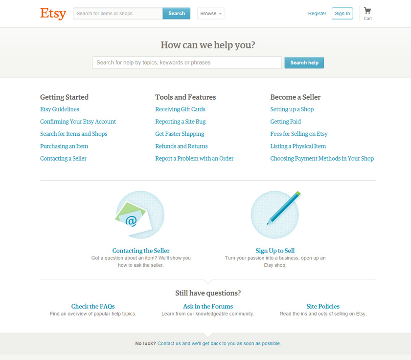
Etsy’s help page
Summary
Work through these 10 heuristics to start evaluating a user experience – either on a site you’re designing or something that already exists. Ignoring them could result in your users dragging their equipment into a field to smash it with a baseball bat!
If you come across any examples where the heuristics are in place (or have been woefully ignored) then go ahead and share them in the comments section below!

Hello Amy,
I usually don’t leave comments to any blogs I read but your blog provoked me so much to appreciate your writing and explanation. I understood every bit of it clearly and the examples you used were spot on. Thank you and keep writing.