Last Wednesday, I spent an evening at Innovation Warehouse for a UX Hackathon organised by CareerFoundry and sponsored by Cogs Agency who provided vital help in the form of pizza and beer.
We put together research, personas, branding, information architecture, user flows, wireframes and testing for a brief provided to us… and it was amazingly fun! Each of the 12 teams presented their projects, and it was awesome to see what everyone had achieved in such a short time frame.
Spoiler alert: my team won  Here’s the story…
Introduction and brief
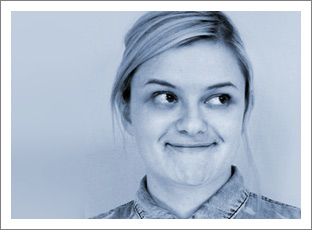
We were quickly organised into teams and Emil Lamprecht from Career Foundry gave an introduction.
Emil Lamprecht from Career Foundry
A sheet of instructions told us to set up a Google Drive folder and share it with our team and Emil. This clever suggestion was indicative of the high level of organisation of the whole event. We were guided clearly and well timed on all the stages of the process.
We were also encouraged to put artifacts straight into Slides, as we went along, so we’d be ready at for a 3 minute presentation at the end. (By the way, Google Slides is excellent and you can find some great looking template themes on Google, but we didn’t have time for slick designs here, everything was kept low-fi!)
Each team picked a brief – ours was centred around organic clothing and worded as a list of business goals, which is a cool way to attack a problem. Even though, as UX-ers, we put the user first – a business obviously has goals to think about.
Our business goals were (paraphrased):
- To sell organic clothes
- To be known and loved for our eco-saving methodology
- To learn what types of clothing are best sold (find a niche)
- Streamlined shopping experience
- Minimum Viable Product – A landing page
Competitor Research
We were told to evaluate 3 competitor websites so I suggested splitting our team into groups. We made notes about the sites in our shared spreadsheet, thinking about good points, bad points and what was missing.
One of our business goals was to find a niche so we noted down what types of products were being sold. From this, we noticed that men were not being targeted, and that children’s clothes were missing. We decided to pick organic children’s clothes as our niche.
Ideas!
We all threw out suggestions for pages, features, vision, ideas and opportunities – which I wrote out onto cards. Then we sorted the cards to work out which were the most important in each category.
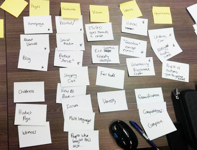
Sorted Cards
One part of our brief was about creating a streamlined shopping process and someone on my team came up with a great idea – a subscription service where new parents would receive a starter box of clothes for a their baby, and then a new selection of clothes every few weeks or months as baby grows.
We had been briefed to create a landing page as an MVP so I pushed for concentrating on a pre-launch page that would explain our eco-friendly vision and the subscription service idea. The goal would be to build a mailing list of potential customers.
User Research
Ideally, persona creation would come after user research but, as we were inside a closed hackathon environment, we wouldn’t necessarily be able to interview appropriate people. The organisers had come up with a clever workaround. We first made up a persona of our target user, Emily, based on a stereotypical idea. Then, when we came to user research, we asked our interviewees to imagine themselves as Emily.
Emily is a 36 year old Psychologist, living in Surrey with her children. Emily is very into her healthy, organic lifestyle and wants the best for her kids so, of course, she’s going to dress them in organic clothes.
We sent two team members to interview people from other teams. We wanted to find out if they’d be interested in the subscription idea but we didn’t want to fall into the trap of pitching them our idea, so we asked them about Amazon’s subscription services for consumable products like nappies. Opinions were positive, people were mainly concerned with price and having control so they wouldn’t be inundated with products.
Our interview team put everything they learned into a spreadsheet and I created a really quick affinity map of the major points, for clarity and the presentation.
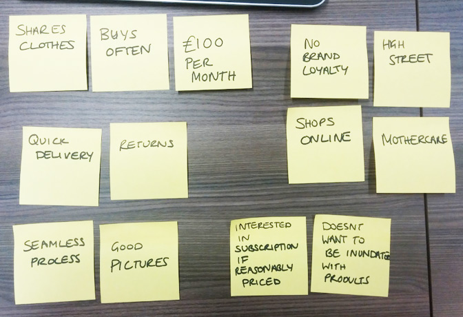
User Research – Affinity Map
Branding
Here we solidified our Value Proposition, which helped us write a Vision Statement, which we pared down into a customer facing Tagline. Having thought all this through, we brainstormed ideas for a name and eventually voted for Little Earthlings.
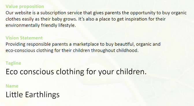
Vision
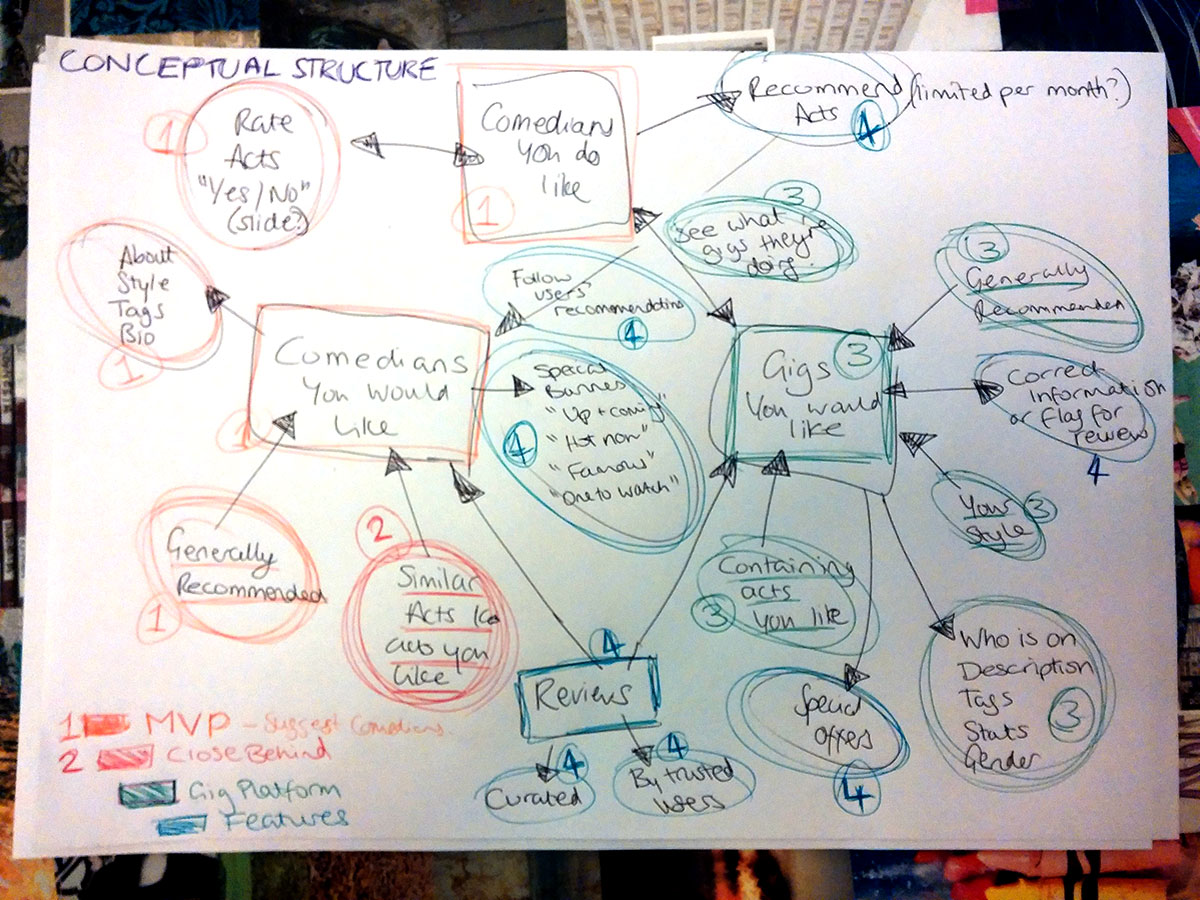
Information Architecture & User Flow
This was probably the hardest part of the evening because, as a team, we all had different ideas of Information Architecture and it was important to remember that we were just concentrating on the MVP at this stage, not getting carried away with mapping out the whole business.
I created this diagram to show the information present in the MVP. The homepage would explain the subscription model, communicate our values, include a feed from social media (to reach our customer base) and link to a blog (to improve SEO). A call to action would sign users up to the newsletter, and they would then be taken to a thank you page.
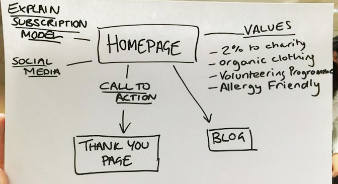
MVP – Information Architecture
Next we created a user flow. Perhaps we got a little over complicated here, as we didn’t strictly need users to provide more information than an email address. However, it did give us a chance to use a billion-dollar-decision-diamond, which is always fun. Also, setting things out in two stages lets the user decide how much information they really want to give us at this stage, without losing them if they only want to quickly fill out an email address.
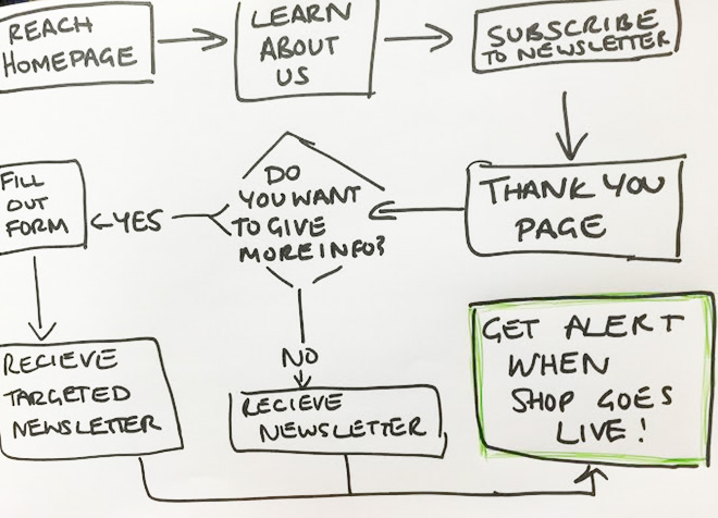
MVP – User Flow
Wireframe & Design
I’ll be honest, I wasn’t super involved in the wireframe! I set about preparing a discussion guide and scenarios for testing, while a couple of others developed this sketch.
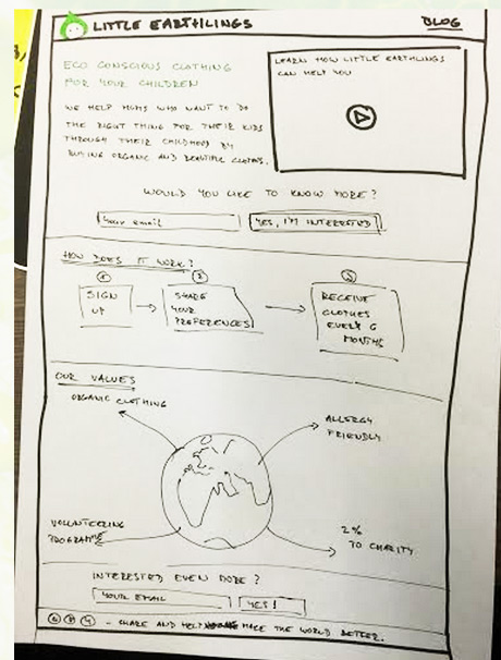
Wireframe
Around this time also, another team member suddenly surprised with this adorable logo she’d created!
Logo
Usability Testing
I was the interviewer this time and, with another team member taking notes, we spoke to two people (each imagining themselves to be our persona, Emily).
We showed them a competitor website, then our tagline, name and wireframe. For each, we asked their first impressions and opinions. Then we took them through a couple of scenarios to see how easily they could complete these tasks:
- Find out more about the company’s values
- Sign up for the newsletter
They were able to complete these tasks but they did have some problems and criticisms!
I created a little affinity map of what we learned. On the left are comments about the competitor website, on the right is ours.
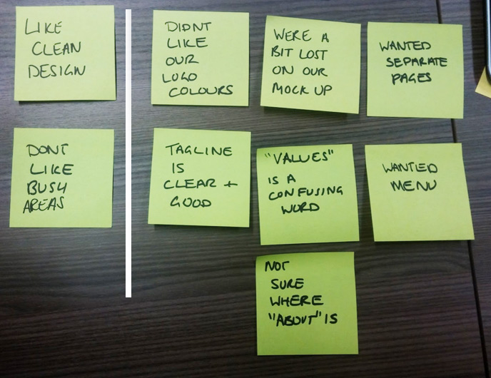
Testing
Iteration
Test subjects found the logo a bit cold, which was an easy fix, we added orange!
Adjusted Logo
We created a second iteration of the wireframe to solve some of the issues we’d uncovered.
- Added a menu in the top right to guide the user around the page (this would scroll down to anchor tags)
- Changed some language – we’d used “Our Values” but people were searching for the more common, “About Us”
- Re sketched the top section for clarity
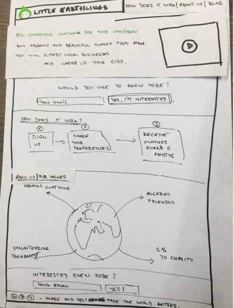
Adjusted wireframe
There’s obviously more we could have done, but we were reaching the end of our time!
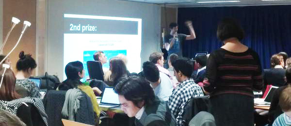
Presentations
We had about 15 more minutes to ready ourselves for presentation time. I offered to present our slides, and we all scrabbled around making various amends, adding in photographs, and tidying up. The pressure was really on at this point, we were nervous and excited to see what we were up against in the other teams!
3 minutes is a really short time so it was tough to fit everything in – imagine me reading this entire blog post at top speed…
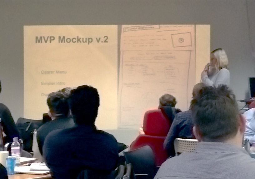
Me giving our presentation
Aftermath
When all the presentations were over, we cleared up our space and headed home – I was buzzing the whole way.
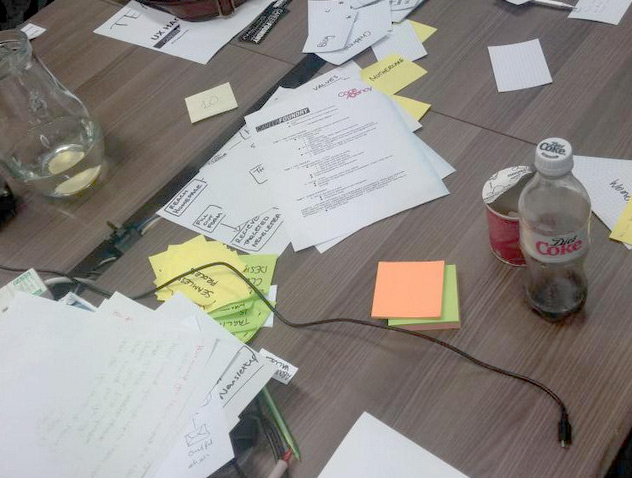
We’d made a mess!
It was great to meet everyone on my team, I feel like we were lucky to have got along so well through a high pressure hackathon, and the whole process was really collaborative!
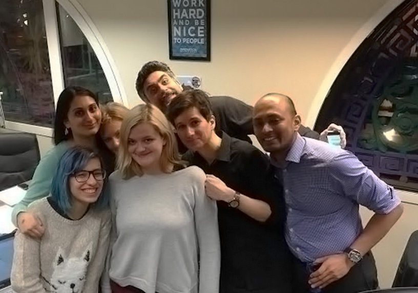
Team 10
Team 10: Yanne Moreira, Uma Makan, Caroline White, Amy Goodchild, Giovanni Dimaggio, Matej Kaninsky and Dhilhan Hannan
I was amazed at how well run the whole event was. There must have been around 80 participants and Emil, Annie and the mentor team did an excellent job of keeping us on track and motivated.
It was so exciting to put my UX skills to the test against the clock. The next day at work, I was obsessively refreshing my email until the winners announcement came through from Annie at CareerFoundry. We were thrilled to learn we took First Place!
Thanks CF and Cogs agency for the experience! Can’t wait for the next one!